Simplifying receivables for small businesses in Brazil
In this case study, I redesigned the receivables experience in QuickBooks to help Brazilian small businesses collect payments faster, focusing on clarity, ease, and human connection.

Context:
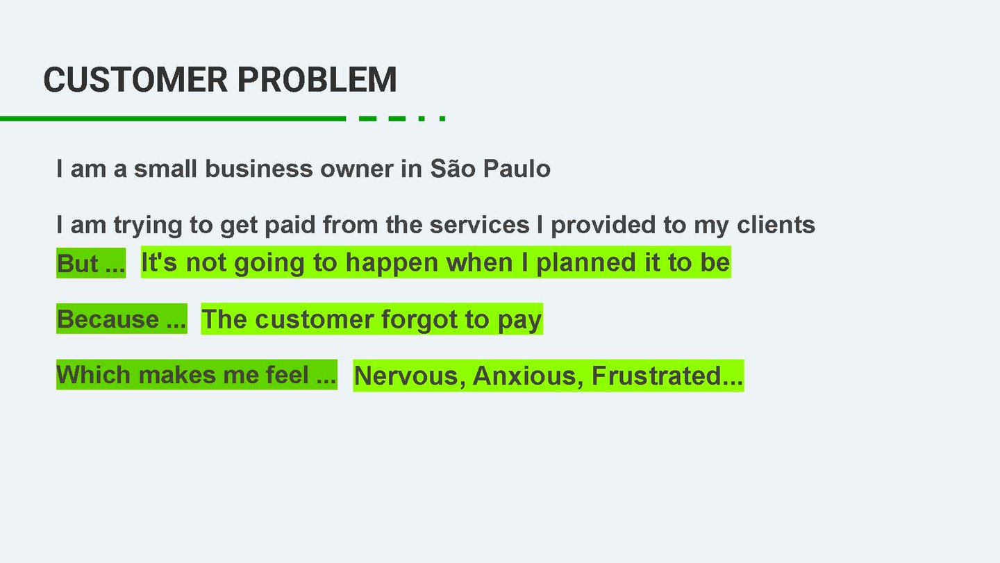
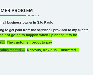
Based on a fictional persona created to represent Brazilian small business owners like him, in his case, someone who sells industrial safety equipment. He uses QuickBooks to send quotes and invoices, but collecting payments is difficult. Customers are often confused or delay payments, and he spends valuable time sending reminders.
This scenario reflects the experience of many entrepreneurs in Brazil, where getting paid involves uncertainty, lack of visibility, and high cognitive load. Our team set out to address these challenges through design.
Project Overview
Objective:
Make it easier for small business owners in Brazil to get paid through QuickBooks by simplifying the receivables experience, from quote to payment confirmation, for both senders and recipients.
Duration:
October - 2022
My Role:
I was responsible for the entire design process, including:
Conducting user interviews and identifying key pain points
Designing and iterating on wireframes and high-fidelity prototypes
Planning and conducting usability testing sessions
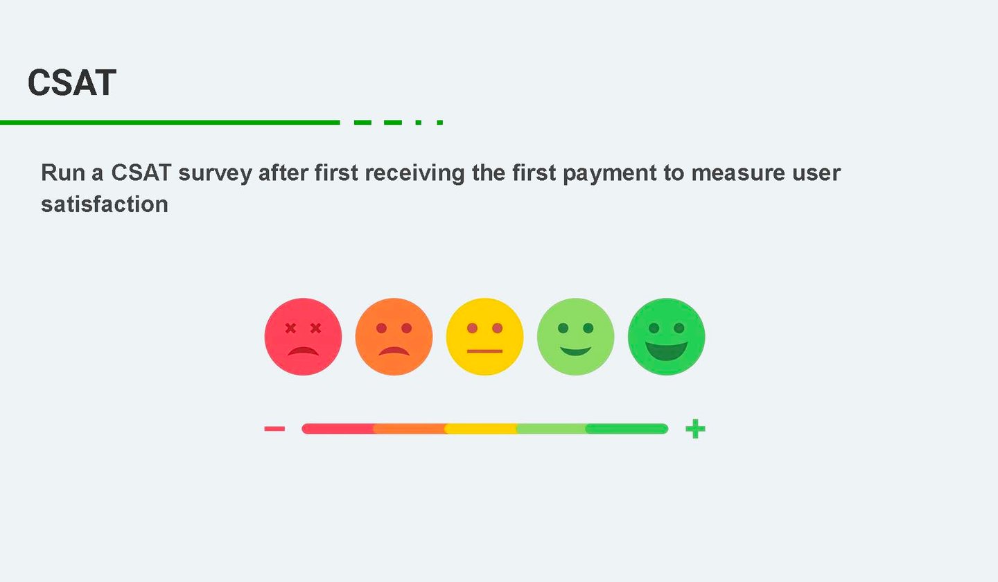
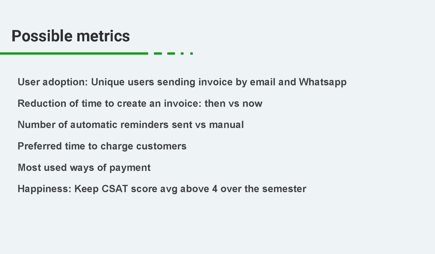
Defining possible success metrics and aligning with business goals
Ensuring the experience addressed both emotional and functional needs
Fixed-Rate Policy:
Initially, LS operated with fixed rates, which didn’t align with how carriers typically negotiate in the real market. This led to lower engagement and missed opportunities for both carriers and LS.
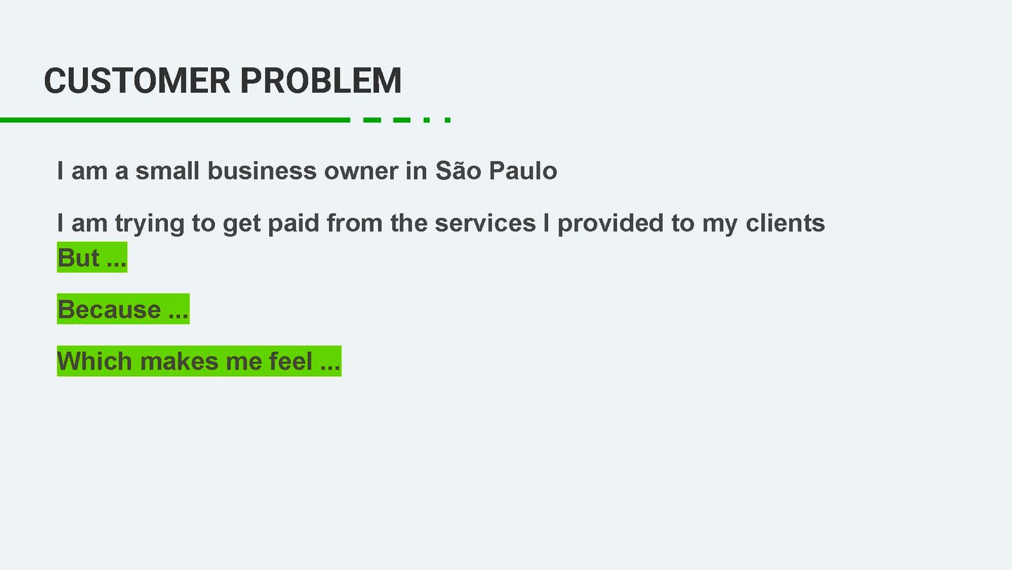
The Problem
Carrier Feedback:
Research revealed that carriers missed the ability to negotiate rates, as it’s a common practice in the industry. They wanted more flexibility and control over the rates they were offered.
Key Challenges:
Low engagement from carriers due to the lack of negotiation options.
Carriers often abandoned the platform because they couldn’t get the rates they desired.
Limited feedback loops for carriers when their bids were rejected or timed out.
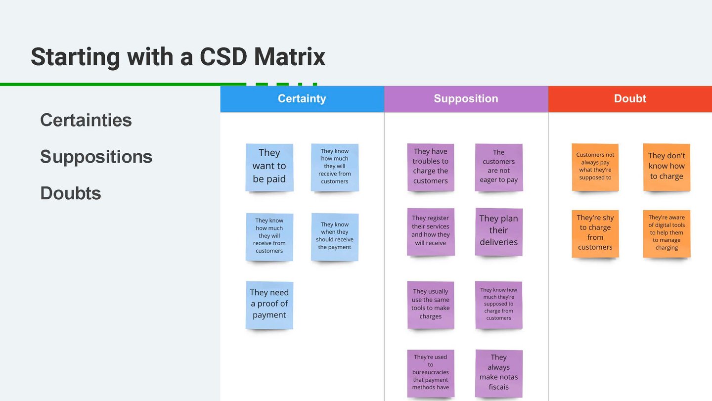
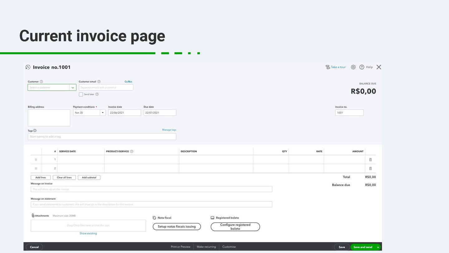
1. Understanding the Problem
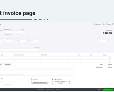
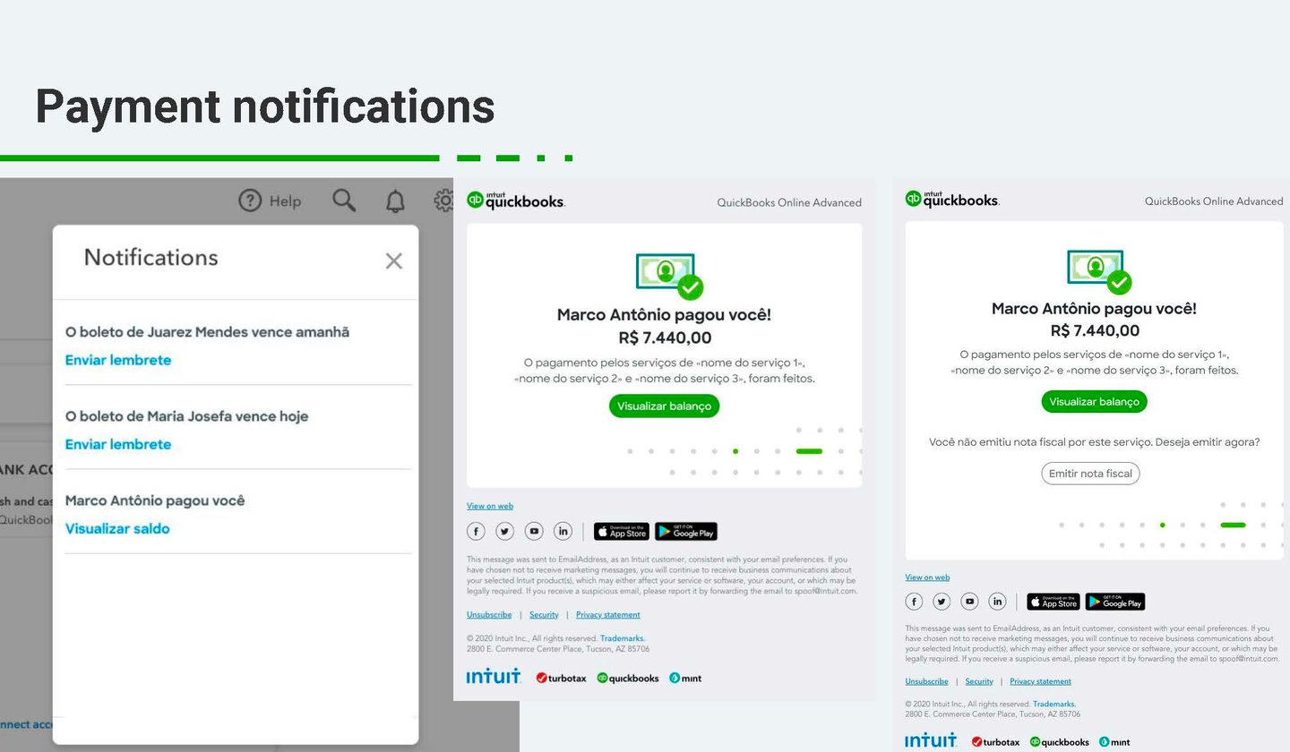
Everything began with identifying friction points in the current QuickBooks payment request experience. Many small business owners, represented by the persona Leandro, felt the tool was unintuitive, rigid, and disconnected from their real communication flows with clients.
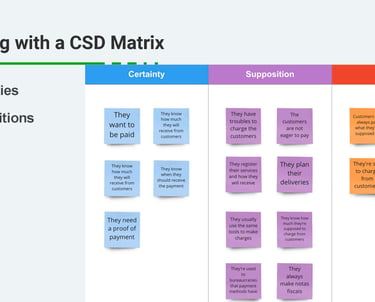
To organize initial assumptions and gaps in knowledge, I used a CSD Matrix (Certainties, Suppositions, Doubts), which helped shape the direction of our investigation.
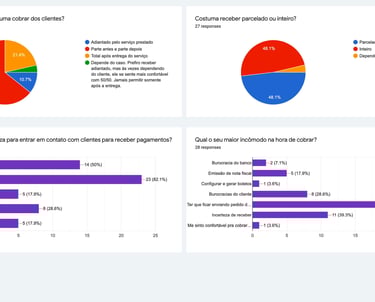
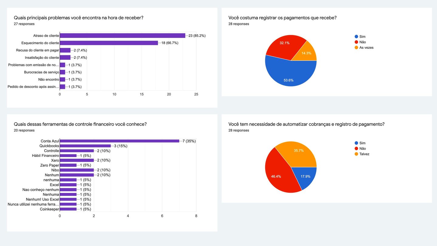
2. Research and Insights
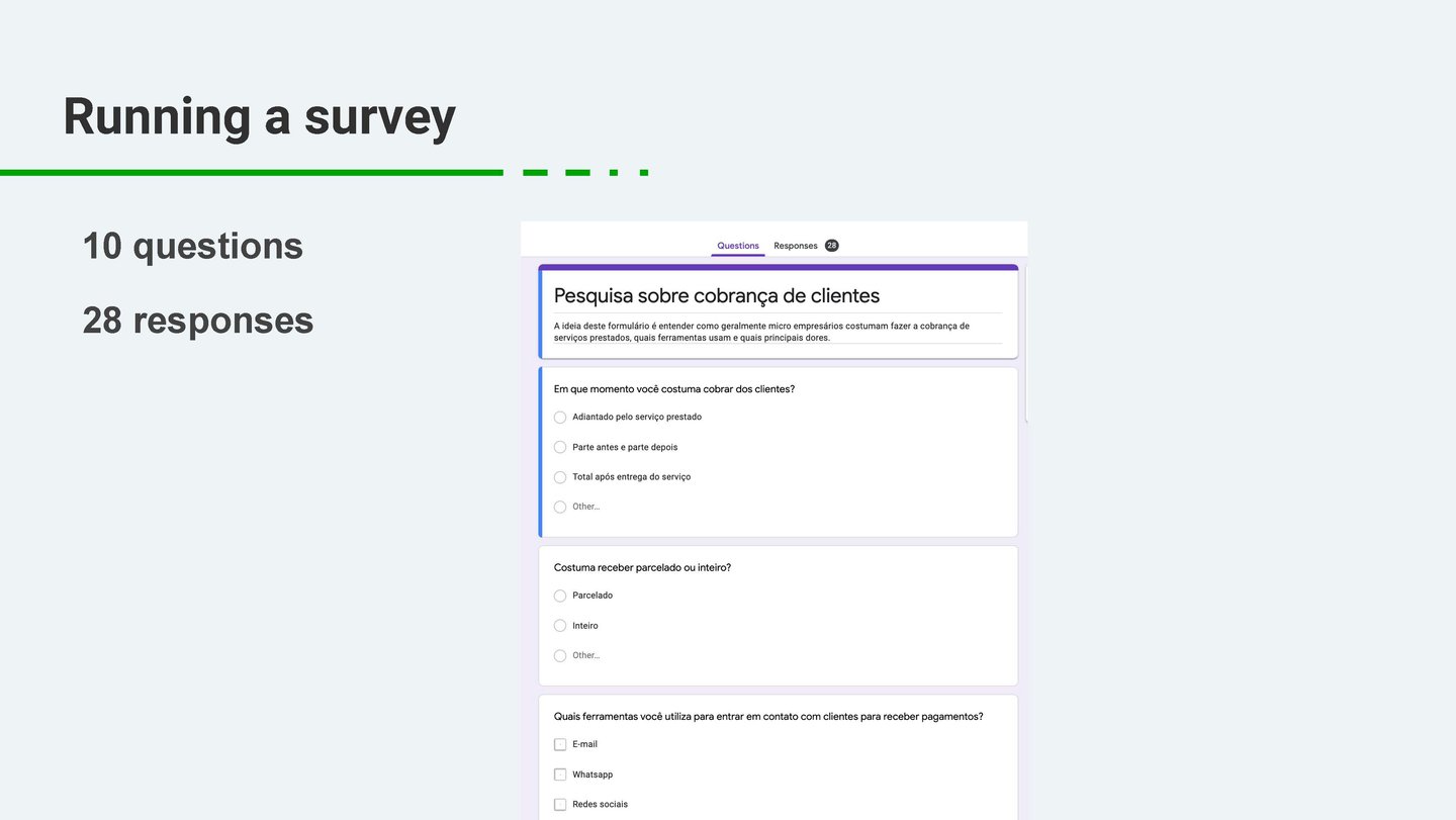
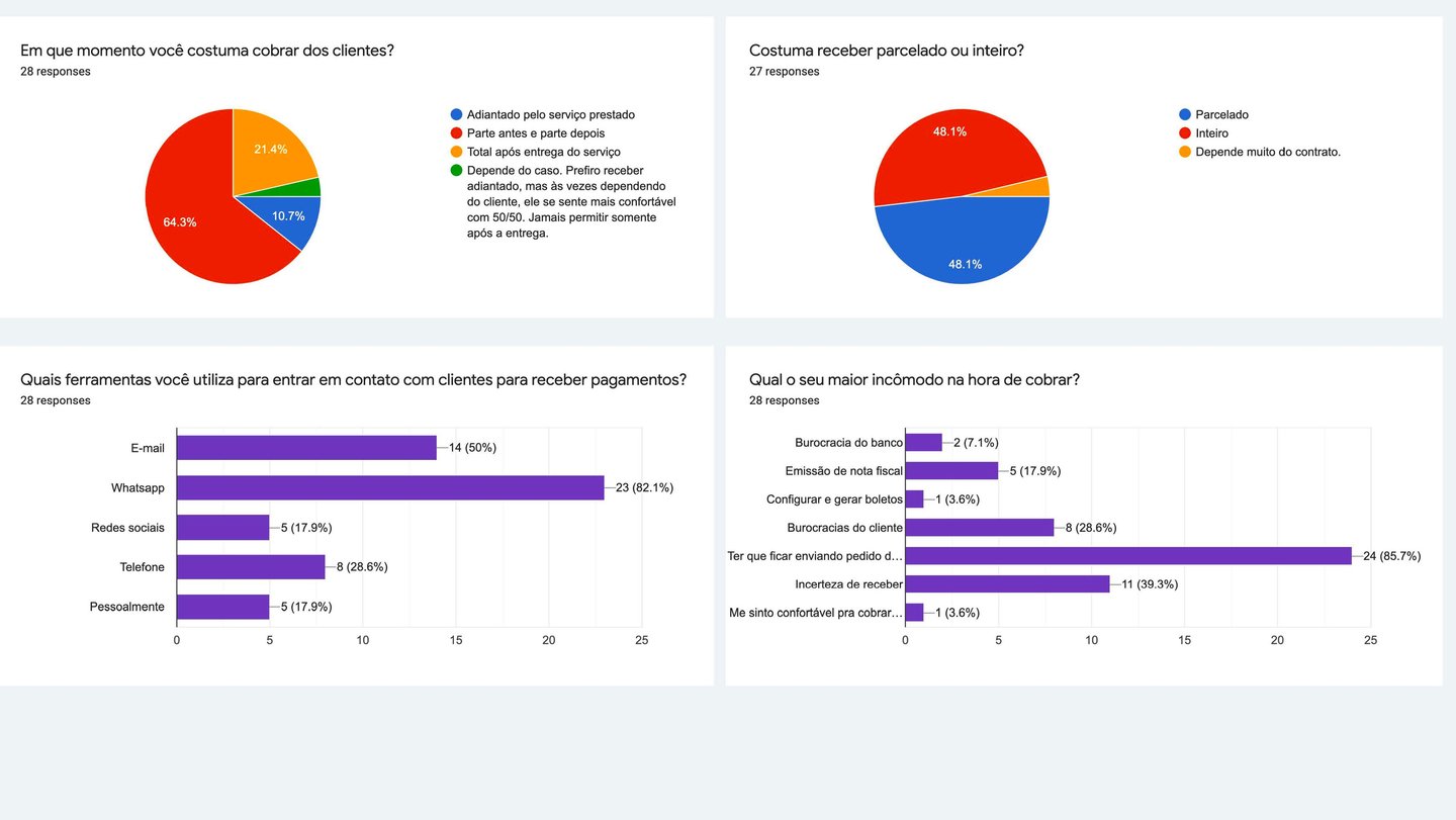
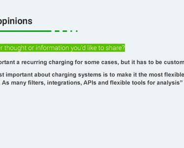
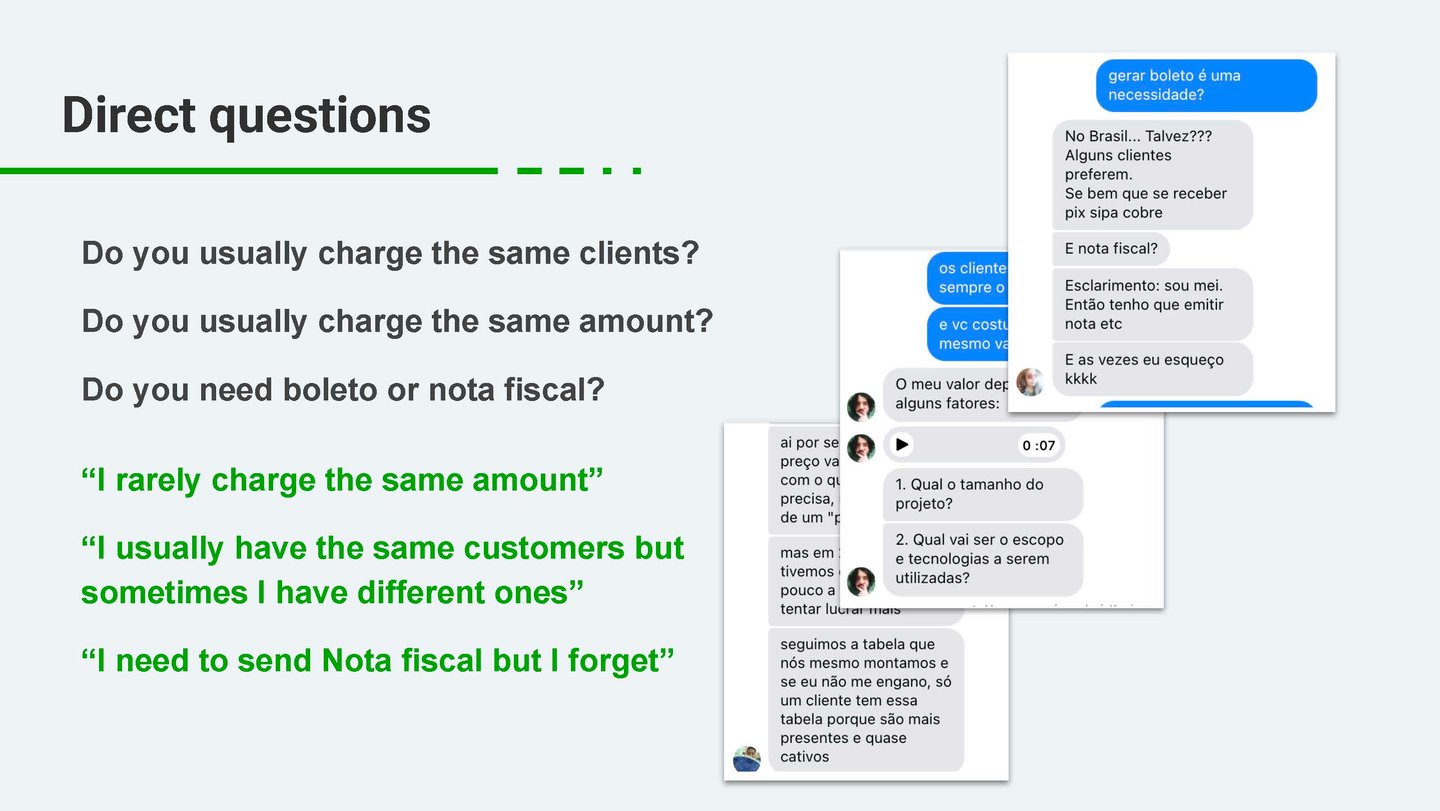
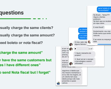
I conducted both quantitative and qualitative research. The data analysis showed low usage rates of the payment request feature, while interviews revealed deeper emotional and practical barriers.
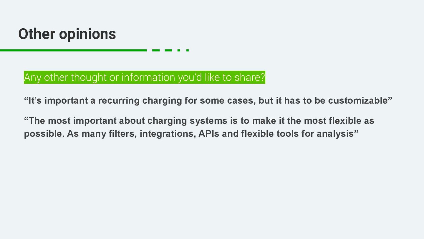
Interviewees expressed frustration with the lack of flexibility and the impersonal tone of the system-generated messages. They also preferred more direct channels like WhatsApp or personalized email content. This insight validated the pain points Leandro experienced and guided early design hypotheses.
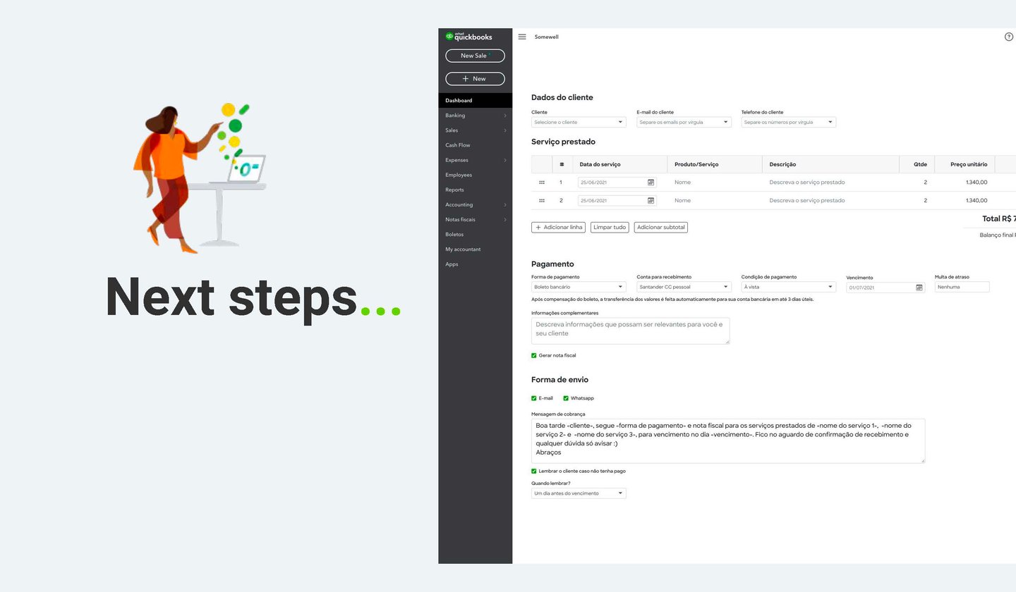
3. Designing and Testing the Solution
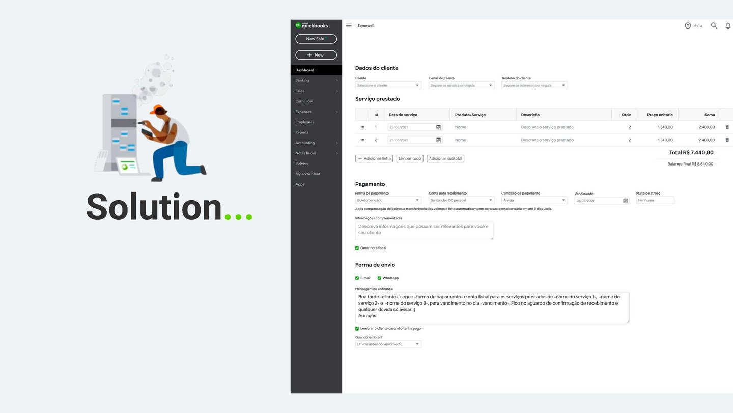
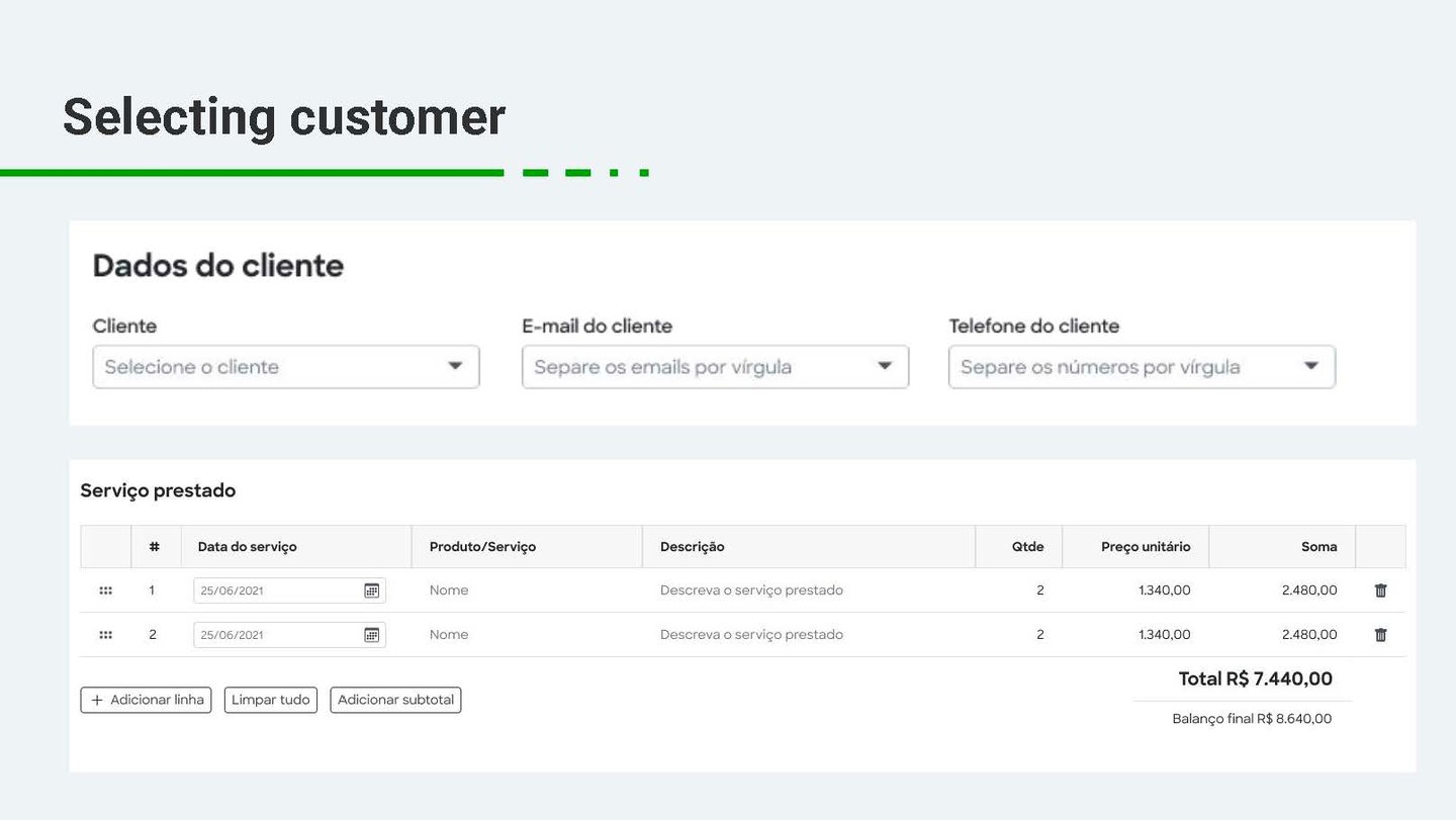
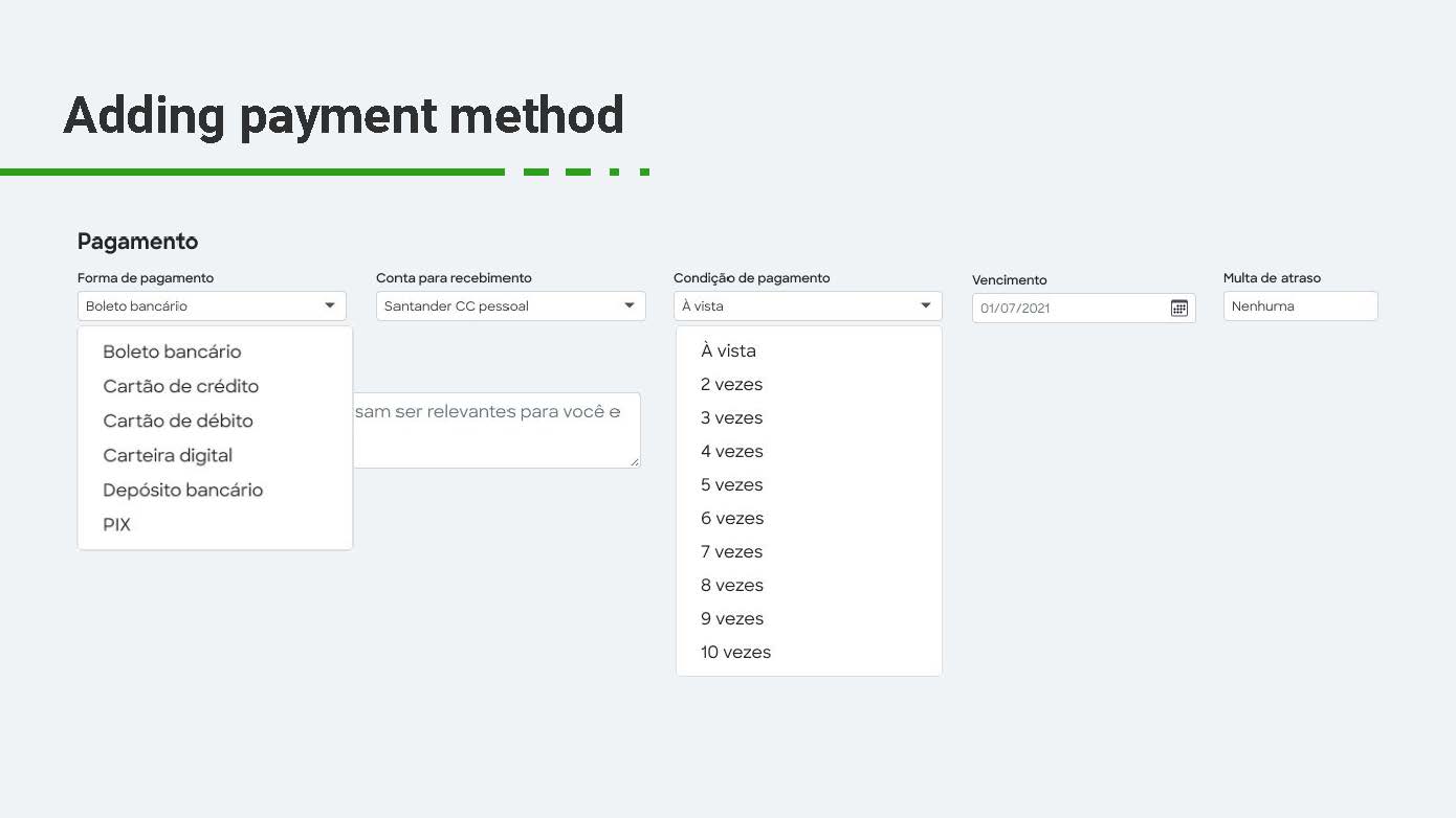
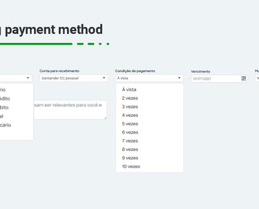
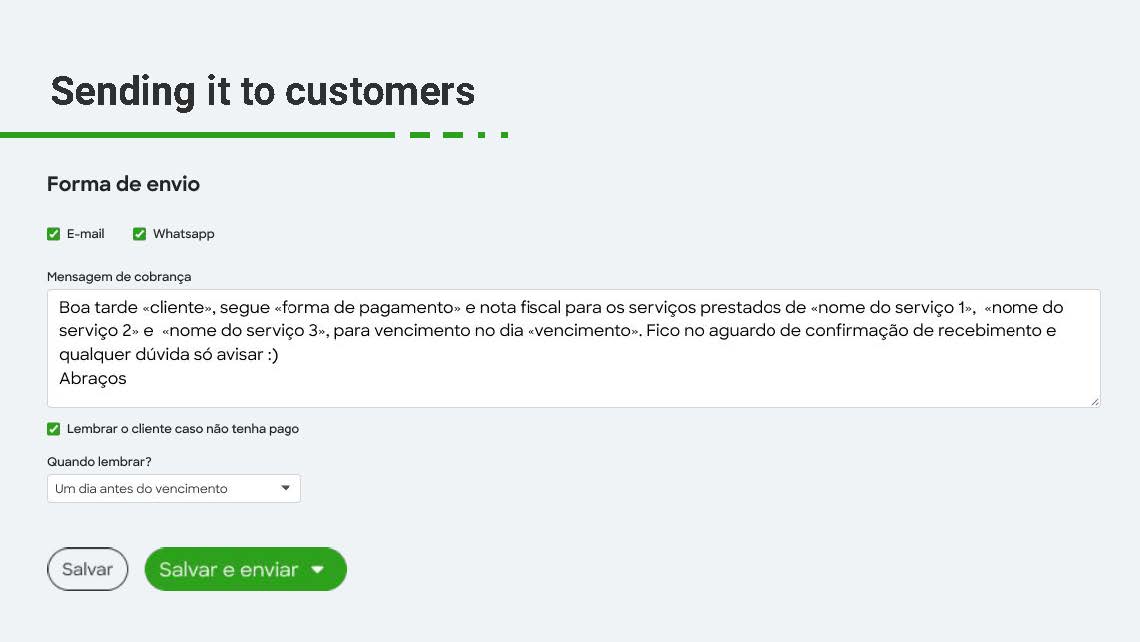
After mapping the limitations of the existing experience, I redesigned the flow with clearer steps, a stronger sense of control, and flexible delivery methods.
The new prototype introduced:
A more intuitive and segmented request flow
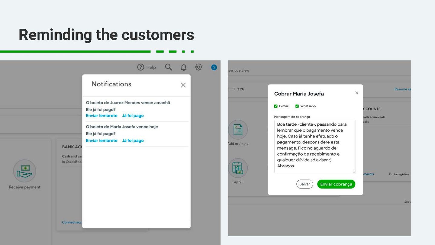
The ability to preview and personalize the message
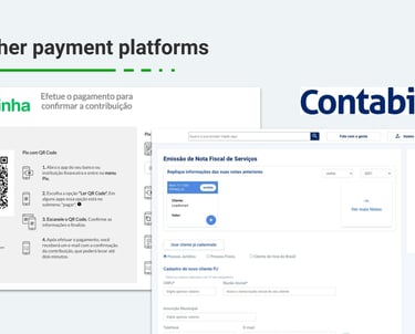
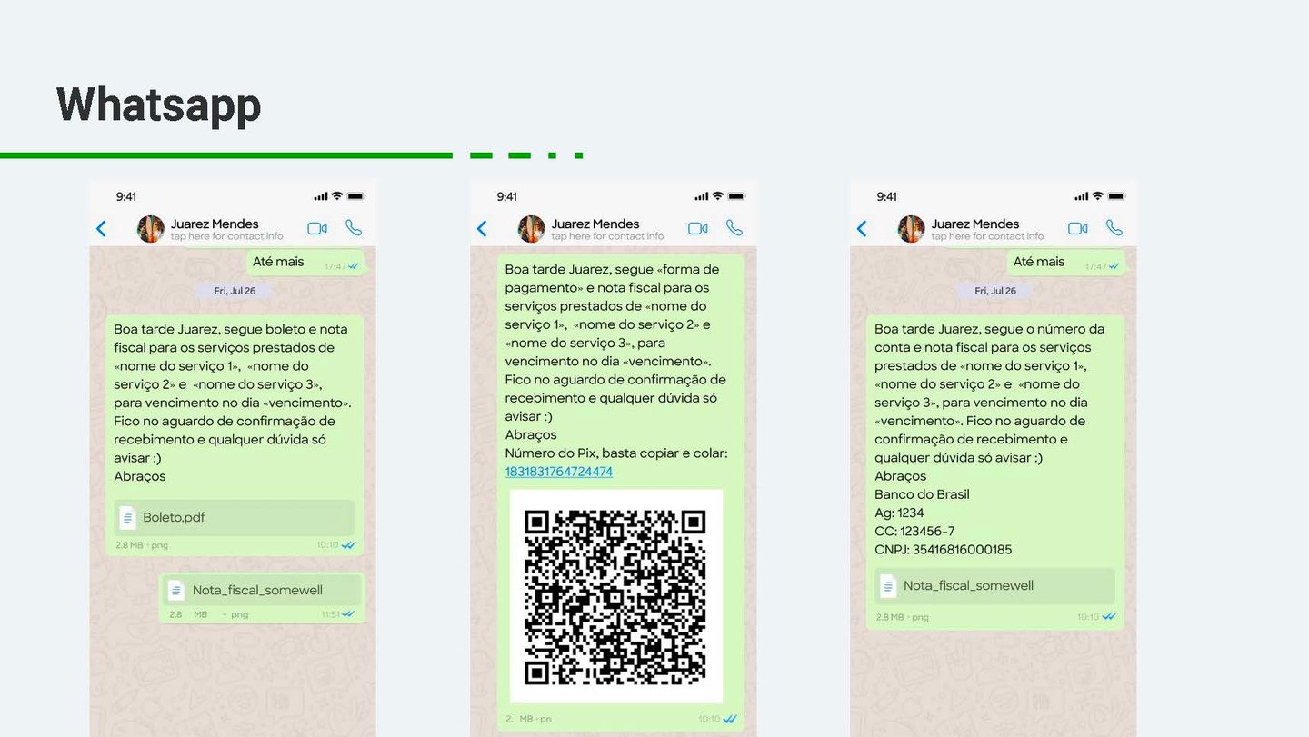
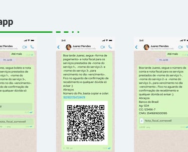
Options to send the request via email or WhatsApp
I then conducted usability testing sessions with participants recruited from the initial research. All testers were able to complete the flow with ease. They reported that the new experience was faster, clearer, and more aligned with how they actually communicate with clients.
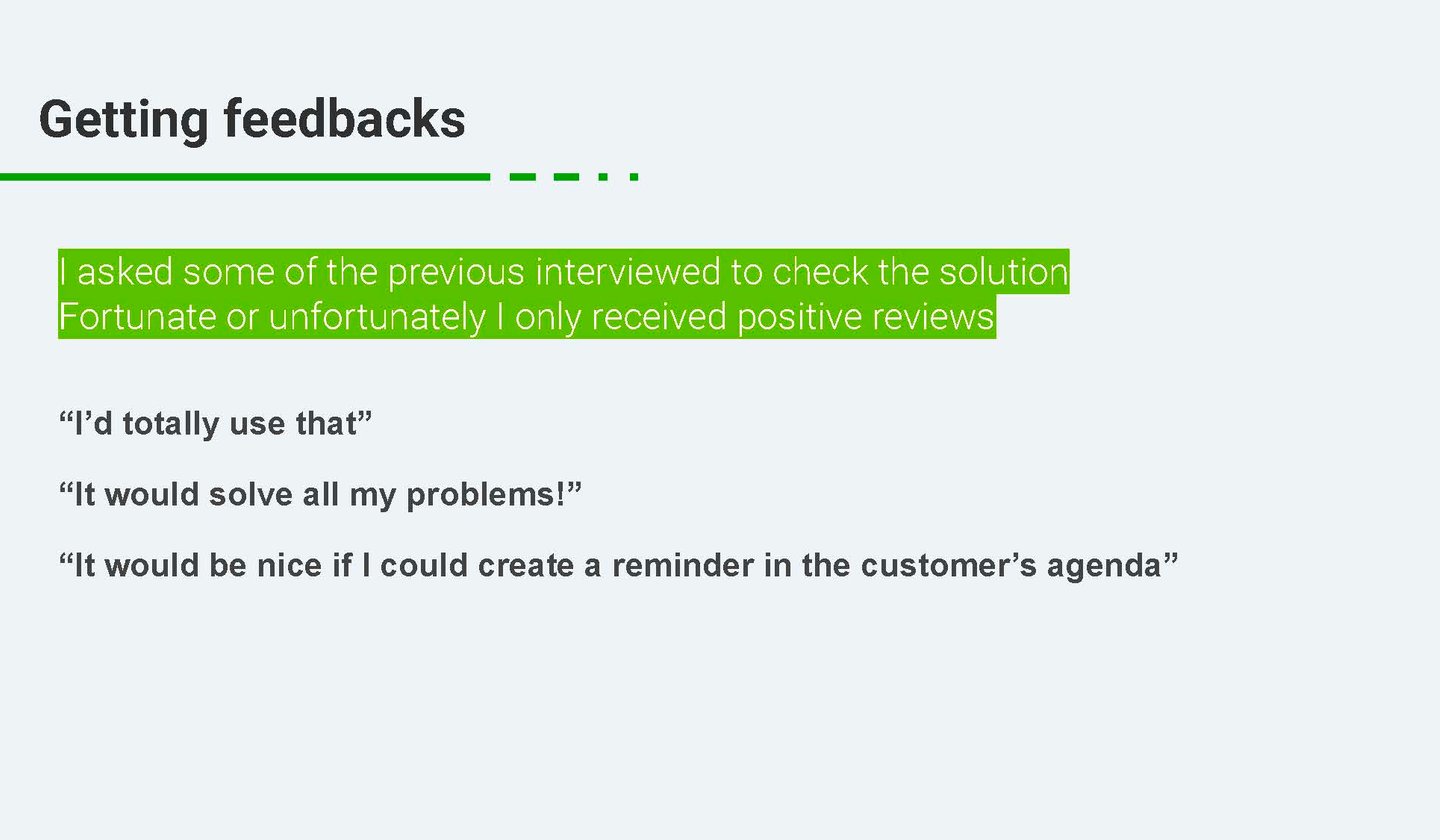
4. Refinement and Next Steps
After testing, I shared the improved version with earlier interviewees, gathering final feedback that reinforced the solution's impact. Their suggestions informed a roadmap of future improvements, including:
Real-time tracking of sent requests
Automated reminders
Suggested message templates
This closed the loop between research, design, testing, and iteration — keeping users at the center of the entire process.
Process
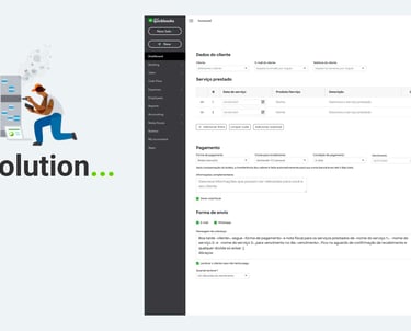
Solution
I redesigned the payment request experience to make it faster, more intuitive, and better aligned with the way small business owners actually communicate with their clients.
The new solution:
Simplifies the flow into clear, digestible steps
Allows users to preview and customize the message before sending
Offers flexible delivery options via email and WhatsApp
Reflects a more human, personal tone in communications
By putting control back in the hands of the user, the tool becomes a true extension of their day-to-day interactions — not a rigid corporate template.

Empathy reveals real friction points: Talking to small business owners showed that the frustration wasn’t with technology itself, but with how impersonal and disconnected it felt from their daily routines.
Small tweaks can lead to big wins: Adding human tone and enabling message customization, simple changes, made users feel more in control and more willing to use the tool.
One-size-fits-all doesn’t work for communication: Offering multiple sending methods (email and WhatsApp) proved essential, as each user had a preferred way to reach clients.
Testing early prevents costly assumptions: Some initial assumptions about terminology and flow were proven wrong during usability testing, allowing us to refine the design quickly.
User feedback is not a phase, it’s a loop: Re-engaging with participants after the solution helped validate decisions and surface new opportunities for improvement.