SEEM Tool
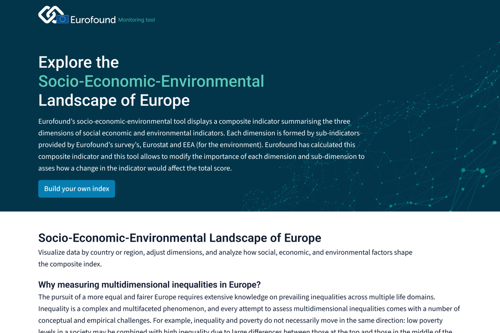
Exploring the Socio-Economic-Environmental Landscape of Europe
Design & UX for an internal multidimensional inequality monitoring platform
About the project
SEEM (Socio-Economic-Environmental Monitoring) Tool is an internal platform developed for Eurofound, in partnership with Imaginary Cloud. Targeted at European Union researchers and analysts, the tool allows users to explore inequality indicators across EU countries through a composite score combining social, economic, and environmental data.
Users can adjust the weight of each dimension and sub-indicator to simulate custom scenarios and observe how different policy priorities would affect inequality scores across member states. The data is sourced from Eurofound surveys, Eurostat, and the European Environment Agency.
Project Overview
Who it’s for
EU researchers, analysts, and policymakers working on the measurement and evaluation of multidimensional inequality across Europe.
Main features
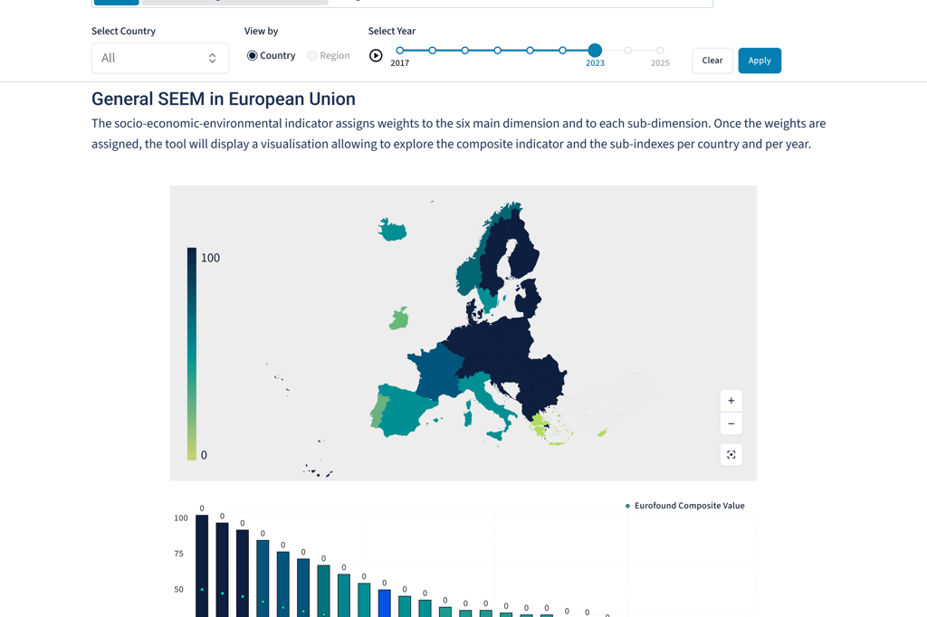
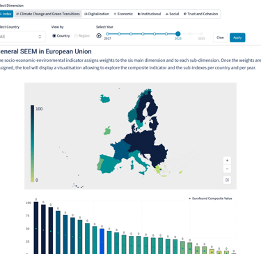
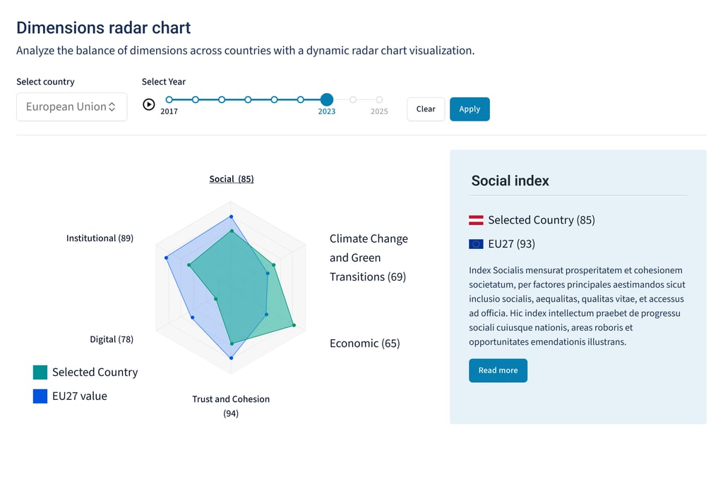
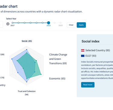
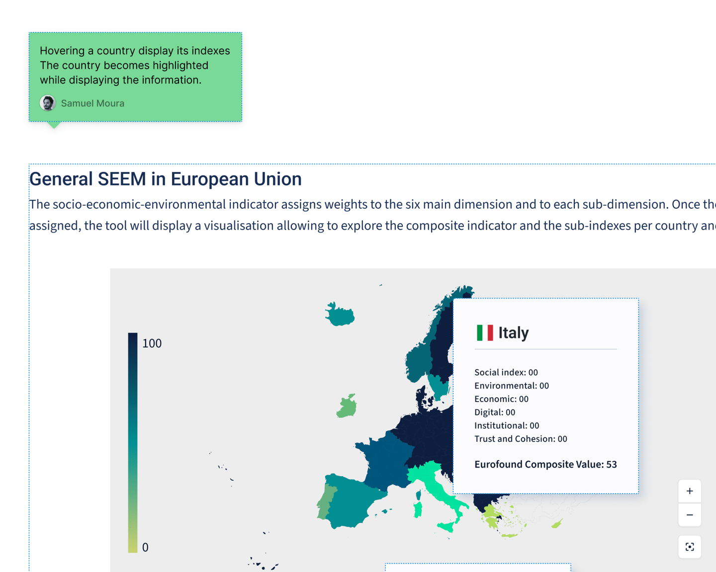
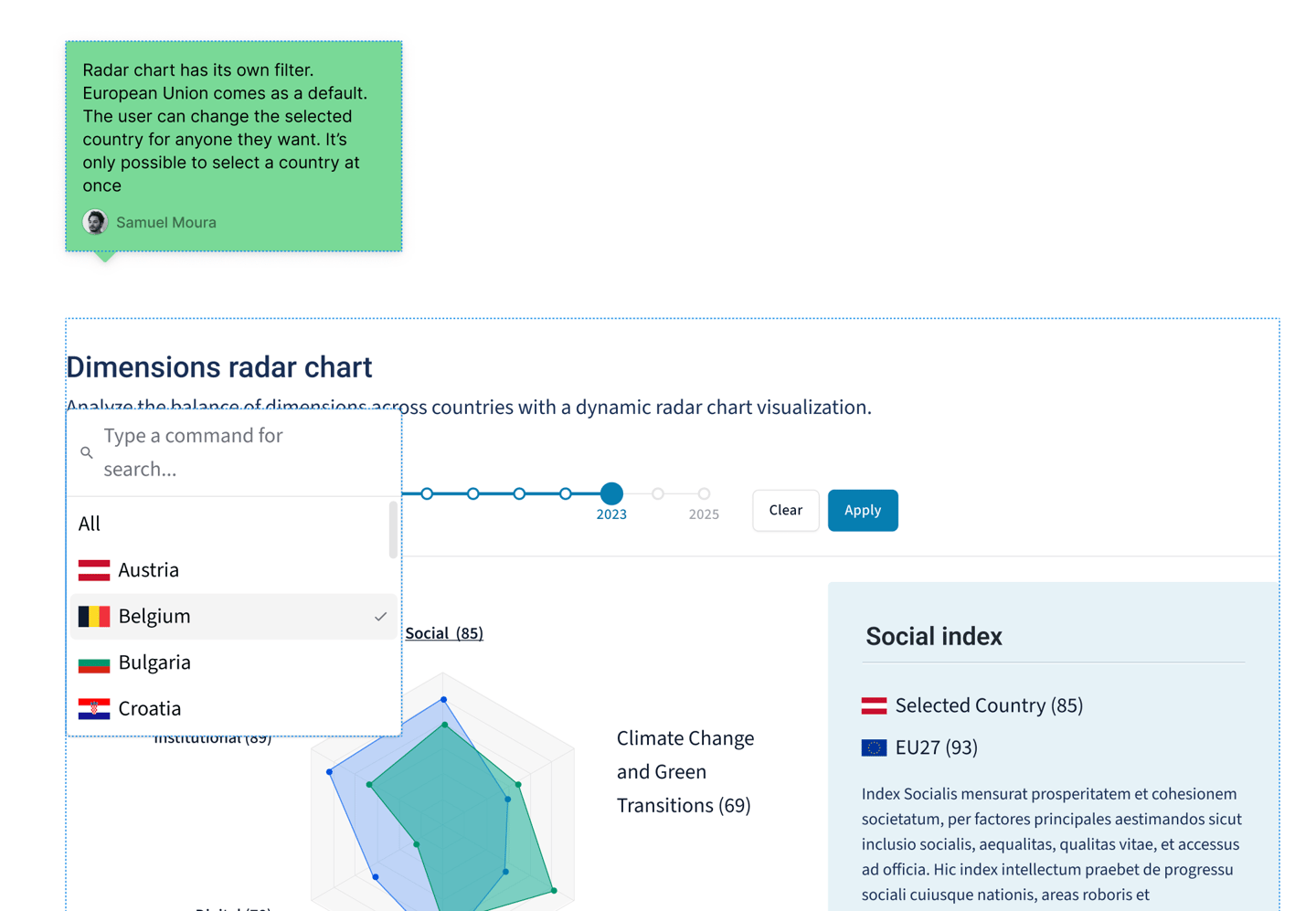
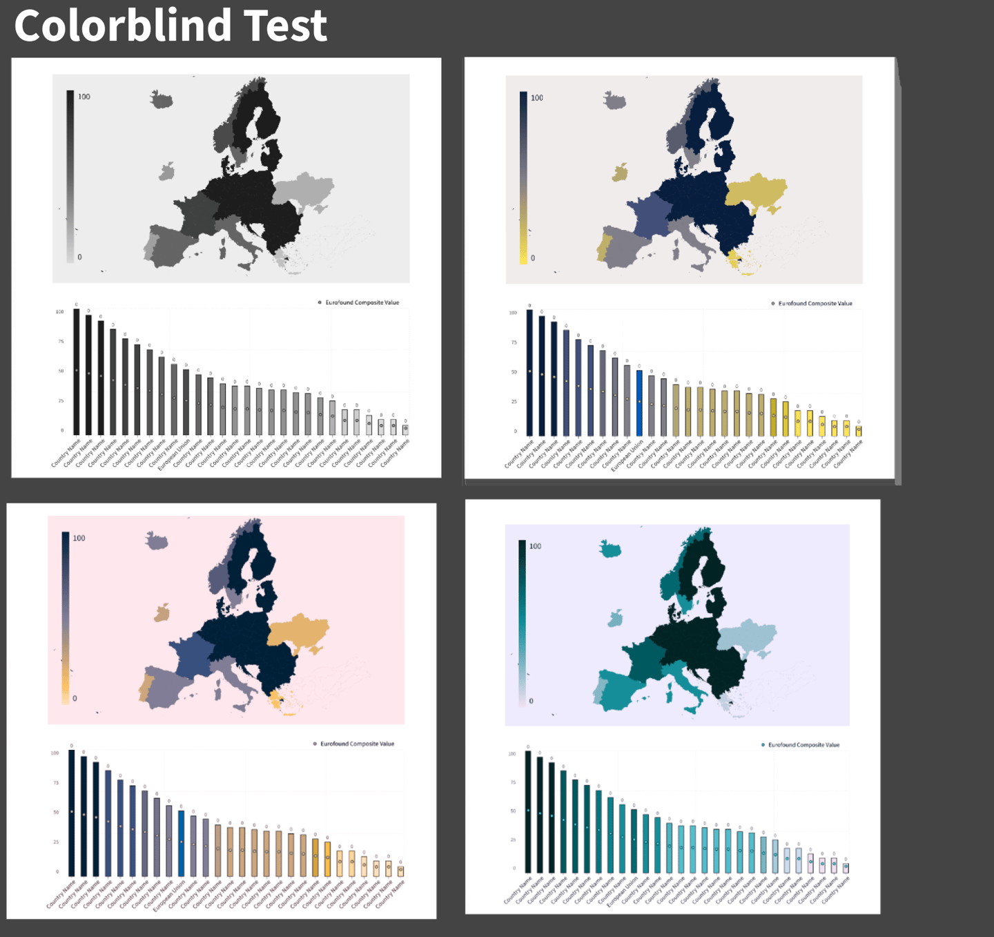
Interactive heatmap visualizing inequality scores per country
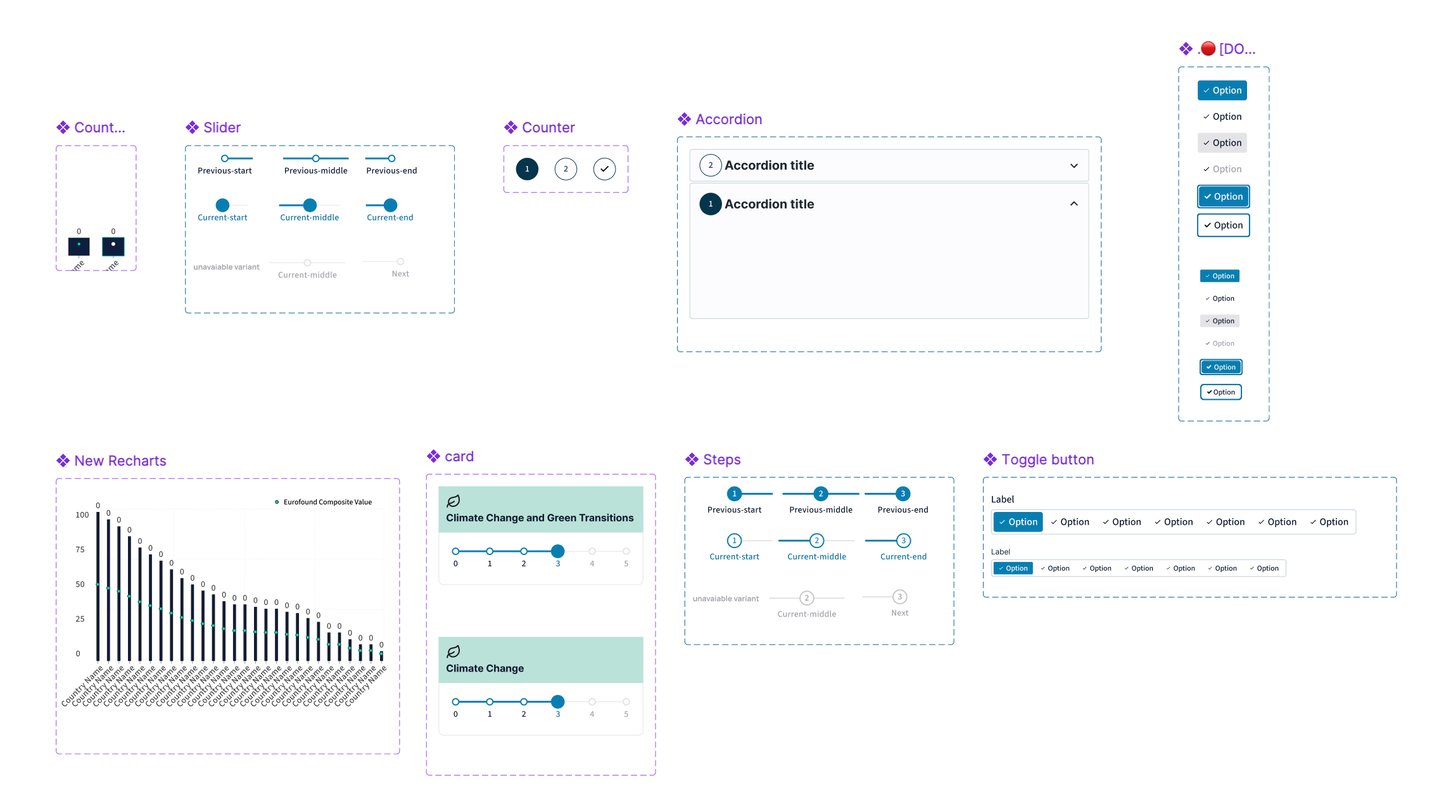
Custom sliders and filters to change indicator weights
Historical data selection by year
Detailed indicator breakdowns by dimension and sub-dimension
Fully integrated into Eurofound’s internal digital ecosystem
Duration:
January - 2025
My role and accomplishments
Led user flow definition in collaboration with stakeholders and researchers
Designed the full UX and UI, with a focus on clarity, accessibility, and data readability
Worked closely with developers to embed and customize interactive map components
Facilitated alignment between design and tech teams to meet institutional standards
Built a modular interface capable of scaling with new data and dimensions
1. Discovery & Alignment
Met with Eurofound stakeholders and researchers to understand their goals, data sources, and how the tool would support EU-level inequality analysis.
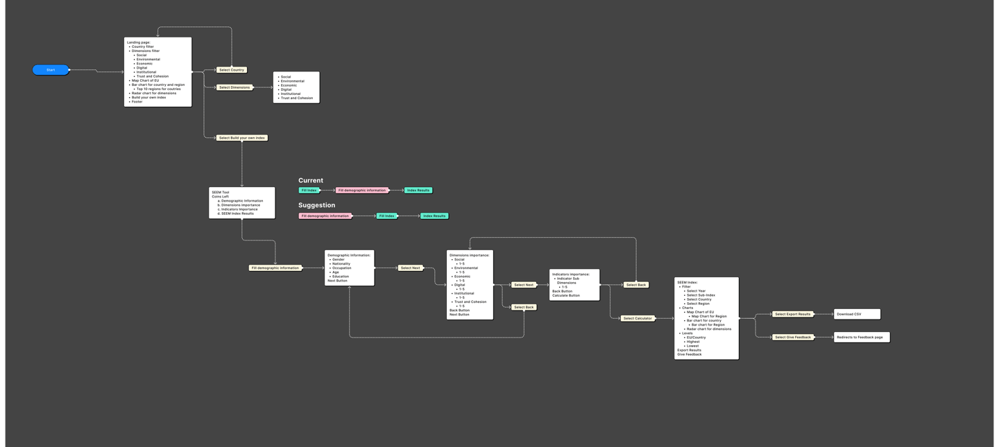
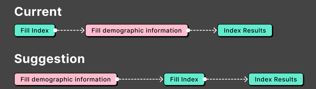
2. User Flow Definition
Mapped key user journeys, focusing on actions like adjusting weights, exploring country scores, filtering by year, and comparing dimensions.
3. Wireframing & Prototyping
Created low- and high-fidelity prototypes to test layout, interactions, and data visualization approaches. Iterated based on internal feedback loops.
4. Technical Feasibility & Collaboration
Worked closely with developers to assess technical constraints—especially around integrating the interactive map—and adjusted designs accordingly.
5. UI Design & System Integration
Designed a clean, modular UI that respected Eurofound’s branding and allowed easy scalability for future data or feature expansions.
6. Accessibility & Validation
Ensured the interface was accessible, following EU standards (contrast, keyboard navigation, screen reader support), and validated with internal users.
7. Delivery & Handover
Provided full design documentation, specs, and components, and supported the development team during implementation and testing.
Process
Solution
We designed a flexible, research-oriented tool that enables EU analysts to simulate and compare inequality scenarios across Europe through a customizable composite indicator.
The interface allows users to adjust the weight of each socio-economic and environmental dimension, instantly reflecting those changes in the heatmap and ranking views. A key goal was to make the complexity of multidimensional data feel manageable and intuitive.
The tool integrates:
A responsive interactive map, with country-level scores visualized through color-coded heatmaps
Custom sliders and filters for weighting indicators and sub-indicators
A timeline selector for year-by-year analysis
A modular, scalable layout that supports future growth and integration with other Eurofound tools
Built to support in-depth policy analysis, the solution balances visual clarity with analytical depth, empowering researchers to explore inequality beyond surface-level metrics.
Successfully delivered a tool that enables policy simulations and in-depth inequality analysis
Received strong feedback from internal users for enhancing visibility and customization of indicators
Strengthened my skills in interactive data visualization and designing for research-driven environments
Gained experience working within EU institutional constraints (accessibility, scalability, data integrity)
Helped promote more evidence-based and adaptable policy analysis through better design